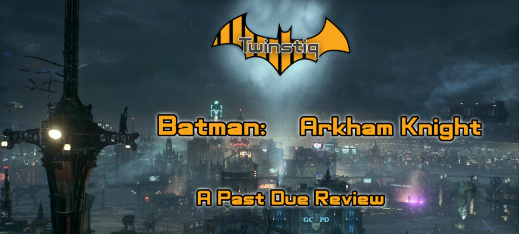
Once again we find ourselves dawning the Cowl to save Gotham from the grasp of another famous Supervillian. This time Scarecrow takes the helm of a plot to cover Gotham in fear, with the aid of the (not so) mysterious Arkham Knight. Like my previous Past Due Review of the Witcher 3, this review will not be scored but instead cover the game on a component by component basis. Such as, animation quality, character and environmental modeling, lighting, particle effects, audio, game mechanics, level design, and more. Every facet of the game will be discussed for at least a paragraph, exploring which sections work well and which ones are the Batmobile...
Animations
Starting off with the best aspect of this game, as well as the other Arkham games, the animation quality in Arkham Knight is superb. Both the combat animations and walk cycles show a great understanding of the animation process with well thought out poses that are strung together through fluid and confident motion. Animations between Batman and the thugs he beats up are hardly ever out of sync, matching up extremely well while keeping the action flowing. We’ll talk a bit more about the team fighting later on, but the if the animations say anything about how well done they are you probably get a good idea of what I’ll have to say about it.
If I have any criticism to offer here, it would have to be that the facial animations can be a bit inconsistent. Selena Kyle, Tim Drake, and Commissioner Gordon for example are great. But the big bats himself along with Scarecrow, the Riddler, and Nightwing look pretty awkward any time they open their mouths. I've got an example below, Light Early Game Spoiler Warning:
#wsite-video-container-507566300929541778{ background: url(//www.weebly.com/uploads/4/7/1/6/47165935/bad_talking_bat_943.jpg); } #video-iframe-507566300929541778{ background: url(//cdn2.editmysite.com/images/util/videojs/play-icon.png?1436207657); } #wsite-video-container-507566300929541778, #video-iframe-507566300929541778{ background-repeat: no-repeat; background-position:center; } @media only screen and (-webkit-min-device-pixel-ratio: 2), only screen and ( min-device-pixel-ratio: 2), only screen and ( min-resolution: 192dpi), only screen and ( min-resolution: 2dppx) { #video-iframe-507566300929541778{ background: url(//cdn2.editmysite.com/images/util/videojs/@2x/play-icon.png?1436207657); background-repeat: no-repeat; background-position:center; background-size: 70px 70px; } } ]]>
Overall, I would say that the character models work well. But again there are some inconsistencies from model to model. Topology across the board looks great, and I’ve never noticed anything that seems out of place from the games grimy, gritty, and dirty art style in any of the characters. I think what really makes or breaks some of these models though are the textures.
Character Modeling

There are no stand out textures, and none of them seem like they have a very high resolution. I can look past that considering the size of the open world, and characters as a whole are fine. However, every object looks like there is a blur overshadowing that item. While the artists took great pains to make these complicated patterns, they just look washed out if you look at them individually.

I will say though that as a whole, each character is unmistakable, even if you barely know any other Batman villain aside from the Joker. Lack of advanced mapping techniques aside, these characters do look like their iconic comic book counterparts, and at the end of the day, that’s what matters. Even if I wish the enemies didn’t all look the same within their respective groups of enemy types.
Environmental Modeling
I said this back in my Witcher review, but I’ll say it again: Yes, character and environmental modeling are not at all the same thing, and anyone who thinks otherwise can answer to this mother f*****

Another great aspect of these Arkham games has always been the incredible sense of atmosphere their environments are able to create. Arkham Knight is no different in this case, areas themed to their respective supervillains are filled with easter eggs and other tiny little details that act as great flair to the hallways and back alleys of Gotham. Being broken up into island sections, the city itself feels and looks massive, with each island having its own theme that some may find doesn’t quite fit the gothic theme of the city. I personally felt a few areas came off a bit more Blade Runner then they did Batman's home turf. Drones, holograms, giant colorful neon signs, and video billboards just don’t scream Gotham to me. Don’t get me wrong I’m a huge cyberpunk fan, and this kind of environment certainly fits with the Arkham Knight’s heavily Philip K. Dick inspired garb, but I wouldn’t be surprised if it threw people off. Gotham to me means tall and ominous gothic inspired buildings that crawl with character, not smart TV's and sci-fi accessories.

|

|
With that said, the environments reflect the kind of Gotham they have built quite well. And keep an eye on those Billboards I mentioned, they deserve a second glance.
Lighting
What should be the most important element of a game about Batman is sadly one of the worst visual elements of Arkham Knight. Even with brightness turned down as far as possible, the game still comes off way too light. Which is ironic since this is easily the darkest Story of all the Arkham games.

|
If you darken your monitor or a screenshot, as I have on the right, everything seems to pop a lot more. I know that you need to be able to see what’s going on, but there’s better ways to do that than having a fill light be nearly as bright as your main light source. What I find frustrating is that the lighting team clearly shows great knowledge of what it takes to light a scene well, even sneaking in some sweet looking Rembrandt lighting every now and then. But none of it gets to be celebrated since the shadows are all overpowered by fill or area lights, washing out the all the hard work that they’ve clearly spent a lot of time on.
|


|
But again, when you edit the image to appreciate the lighting that is hidden under there, it is done incredibly well. Shadows fall in all the right places, light off in the distance draws the eye across the cities beautiful vistas, and it makes me wish the game looked like the second image below 100% of the time.


Particle Effects


|
This game’s smoke is easily the best I’ve seen in a game, ever. Everything else just comes off as serviceable in comparison to it. It’s not that the little sparks, or electric charges aren’t great visual effects, but compared to the smoke effects that your Batmobile creates as you peel out into the streets of Gotham you tend to forget other effects are even in the game. And the streaks of rain that move across your cape will draw your eye as you explore the city. The only odd looking effect is one that looks pretty epic at first, but after a few passes over it begins to look fairly phony in comparison to everything around it. I wish I could describe what this effect is in more detail but that would enter heavy spoiler territory, and it’s hard enough to write a review about this game without spoiling anything in the first two paragraphs. But for those of you who have played the game or watched a let’s play I’m sure you can guess what I am talking about by the image on the bottom left.
|
Audio Effects/Soundtrack
#wsite-video-container-265371134752204372{ background: url(//www.weebly.com/uploads/4/7/1/6/47165935/sond_702.jpg); } #video-iframe-265371134752204372{ background: url(//cdn2.editmysite.com/images/util/videojs/play-icon.png?1436207657); } #wsite-video-container-265371134752204372, #video-iframe-265371134752204372{ background-repeat: no-repeat; background-position:center; } @media only screen and (-webkit-min-device-pixel-ratio: 2), only screen and ( min-device-pixel-ratio: 2), only screen and ( min-resolution: 192dpi), only screen and ( min-resolution: 2dppx) { #video-iframe-265371134752204372{ background: url(//cdn2.editmysite.com/images/util/videojs/@2x/play-icon.png?1436207657); background-repeat: no-repeat; background-position:center; background-size: 70px 70px; } } ]]>
Once again Rocksteady has provided another rock solid element to Arkham Knight’s utility belt. The audio effects in Arkham Knight are just as solid and meaty as they have been in the past. Punches that land as you bounce from enemy to enemy sound impactful, gadgets from your utility belt each sound uniquely appropriate, and the fluttering noises your cape makes as you glide through Gotham are complemented by the ambient sounds of the city. The voice acting, as I mentioned earlier, can be a bit hit or miss. Some characters sound incredible and their performances match up well with their animations. But others sound awkward, flat, and at times don’t match. Thankfully there are only a few instances of bad dialogue, but when they happen, you will definitely notice them.